Coca Cola - OOH + Magazine
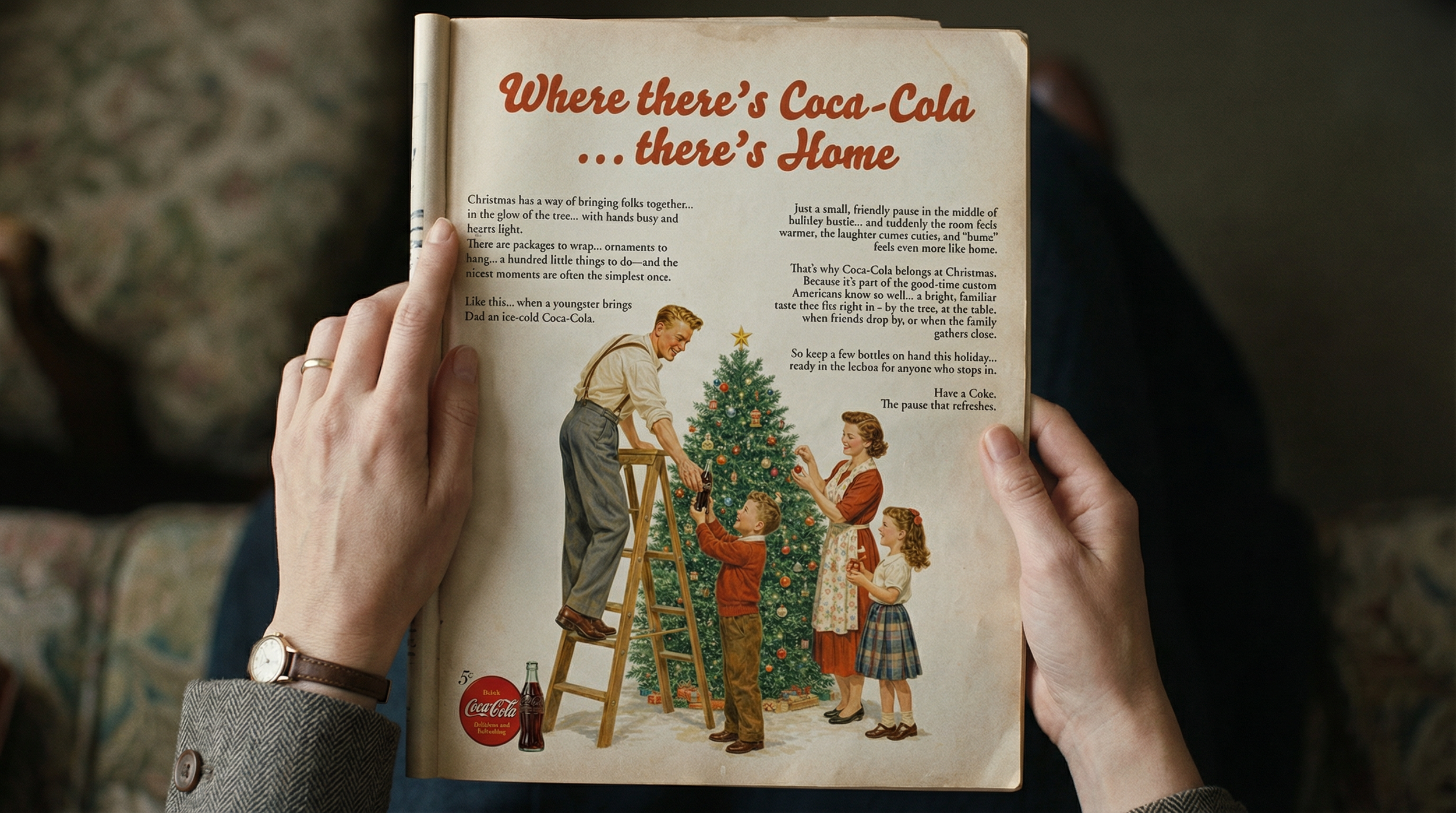
Where There is Coca-Cola - There is Home
The project was designed as a cohesive system rather than a collection of isolated ads.
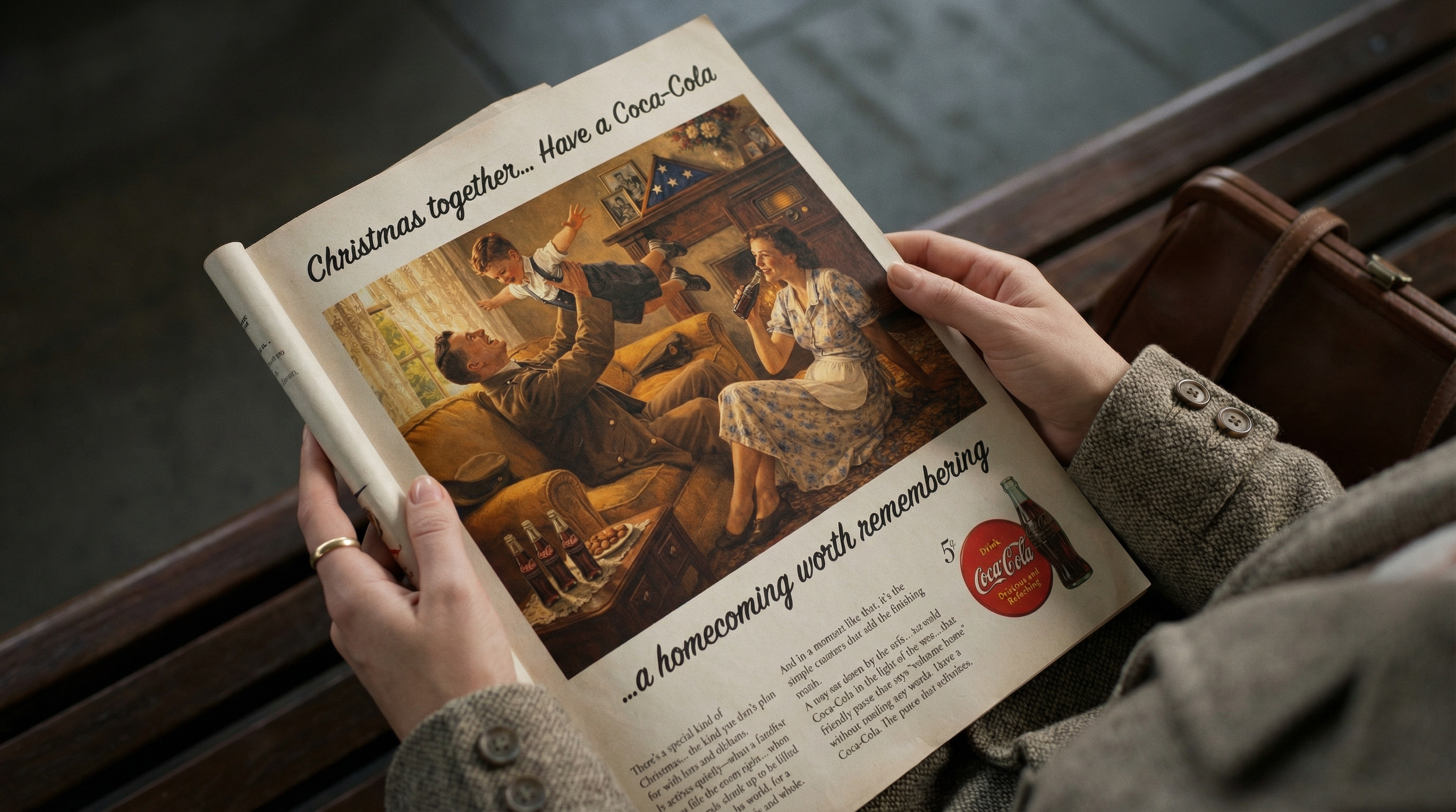
Typical headline and the long-copy cadence of the period, including elements like ellipses, scene-setting, and an “American custom” tone. The copy was rewritten to focus on specific benefits while maintaining a tone of restrained institutional warmth.
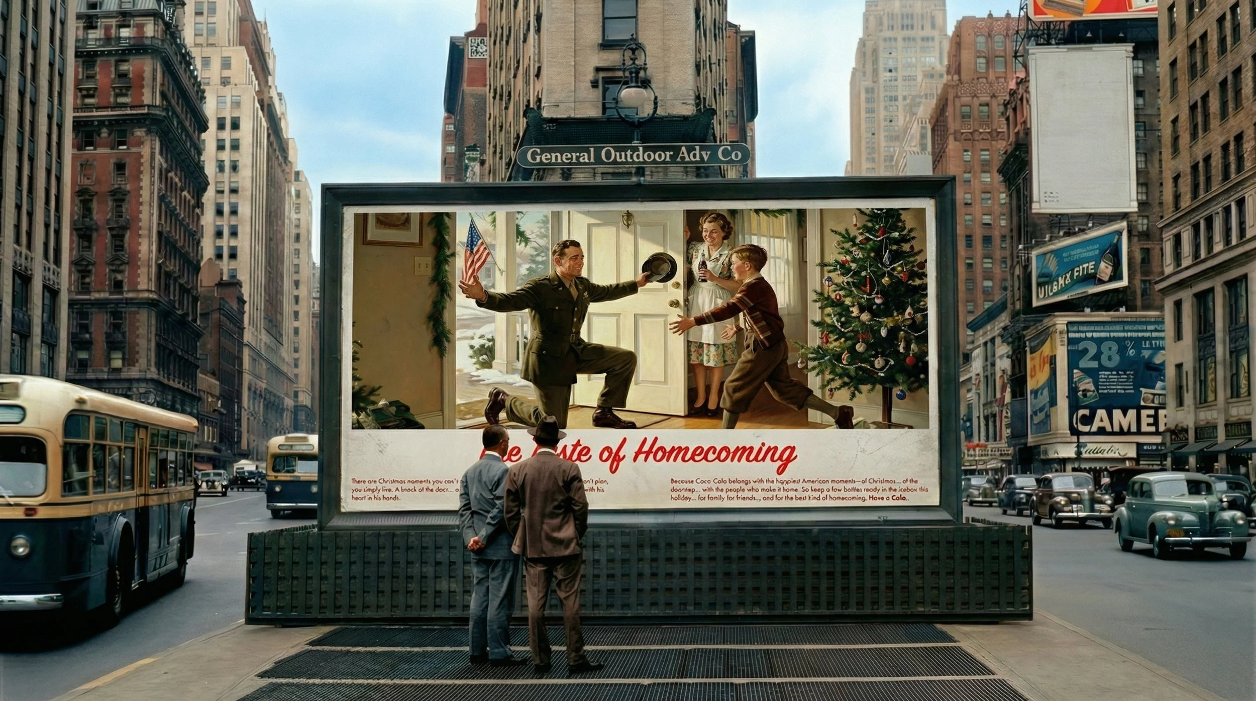
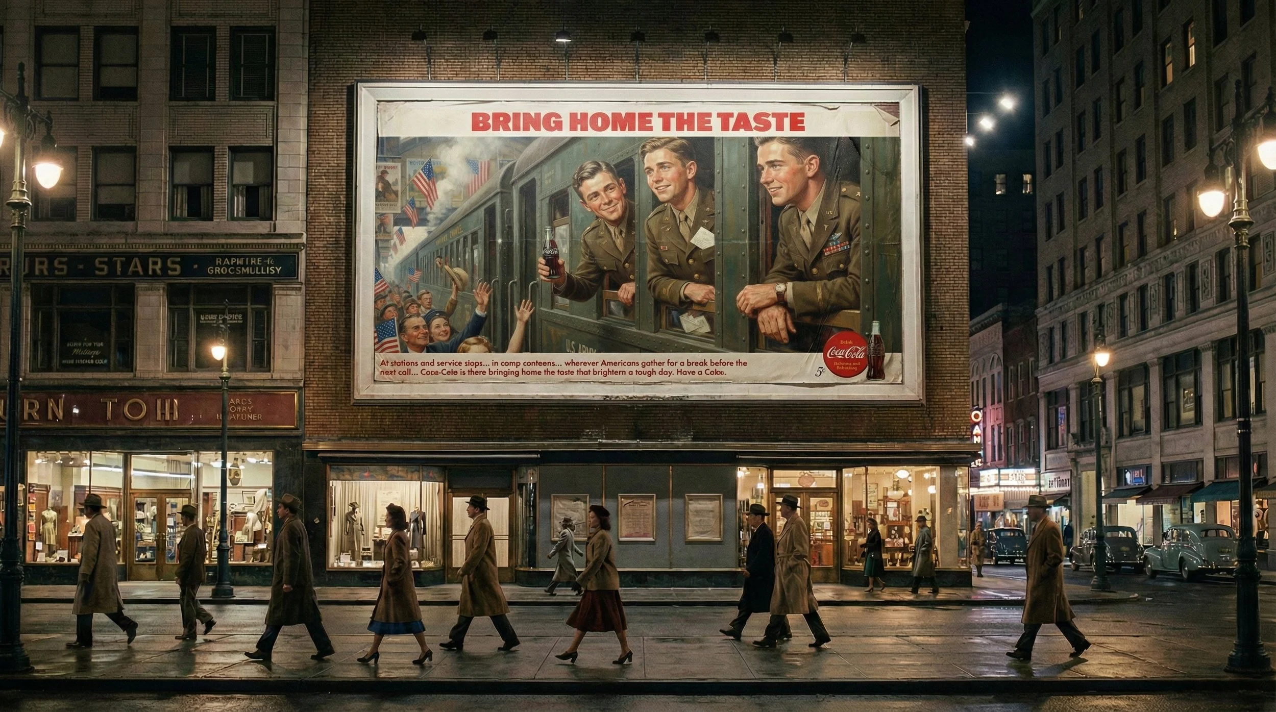
A consistent layout grammar that includes a headline band, a hero scene, a short proof line when necessary, and a standard brand lockup.
Art-directed AI-generated illustrations that evoke a style similar to Norman Rockwell, emphasizing editorial realism. This choice was based on functionality; Rockwell's visual language is optimized for readable storytelling, featuring clear gestures, legible expressions, and domestic details that convey a sense of "home" without the need for further explanation.
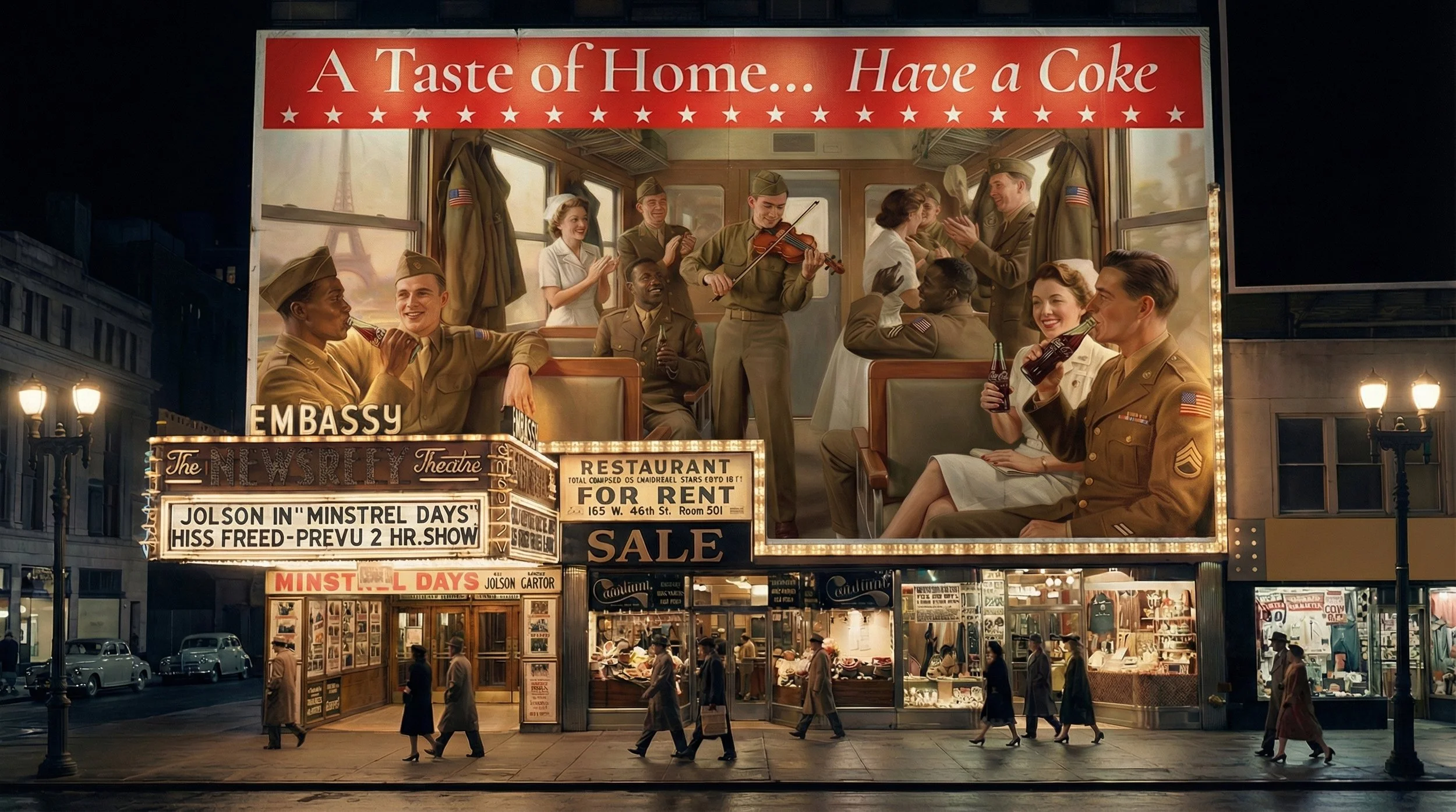
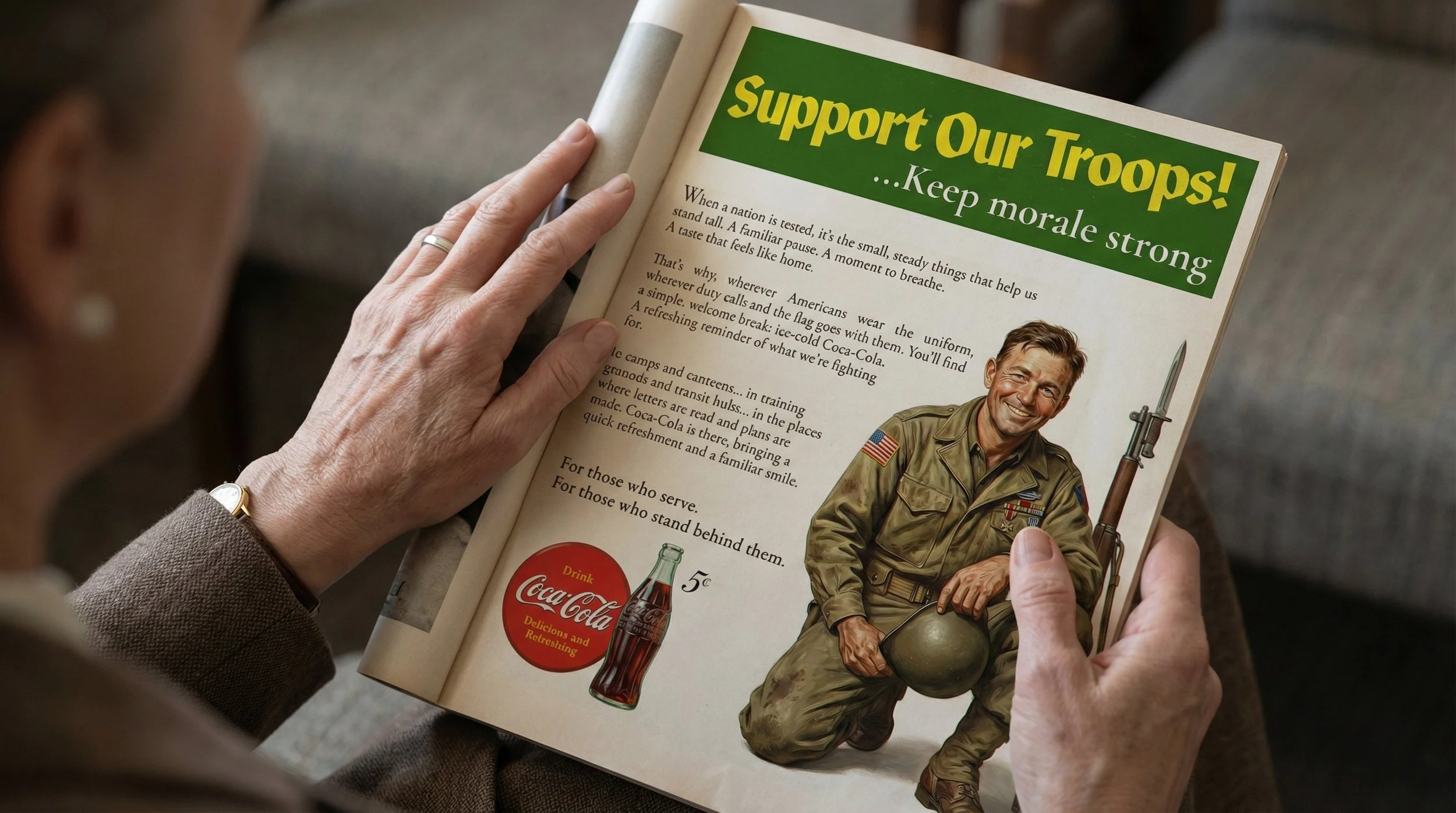
The result is a modular framework that can easily expand to include additional scenes, placements, and timelines without altering the underlying logic. It operates on a simple structure: one premise, one ritual, one headline territory, and one layout.
This framework is designed for:
Quick headline reading from a distance
Extended engagement through illustrative detail and longer copy
Consistent recall through repeated ritual language (e.g., "Have a Coke") and a familiar "home" territory.